LET’S GROW
A brand is a simple way to tell a story. And what a story we have. From our earliest days, we’ve committed to be a positive force for change, a champion for the people. Never satisfied with the way things were, always looking for a better way, acting for a better world.
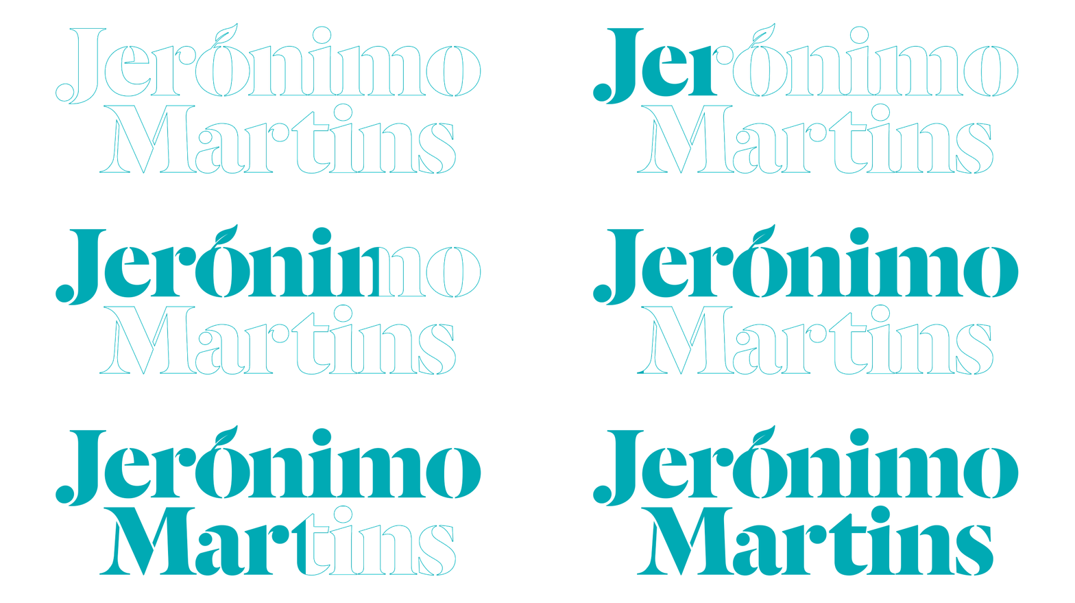
In 2017, we began a new chapter in the extraordinary journey of our brand. And a new language to tell our story is born. With a logo that balances both our heritage and our modernity and puts growth at the very core of who we are.

225 YEARS OF GROWTH
The previous logo was designed in 2003, when the Group’s reality was quite different from what it is today. The Group was at an early stage of its internationalisation experience. Poland accounted only for around 15% of the Group’s EBITDA and we were 10 years away from the opening of the first Colombia stores.

Fourteen years on, we are an international Group, with over two thirds of our sales coming from abroad. We’ve become increasingly focused on the food business and determined to continue to grow.
This new reality asked for a new way to express the history of the Group, a language whose colours were inspired by the freshness of the food world, but also by the passage of time – from the lightness and warmth of dawn through the brightness of noon to the richness of dusk, mirroring the day-to-day of Jerónimo Martins’ customers and growers.
An identity to portray a vibrant picture of the world of food, people and places that have been at the heart of our business for 225 years.

THE REBRANDING PROCESS
Four agencies were invited to submit proposals for the rebranding project – two in Portugal and two in England – under the requirement of never having worked with the Jerónimo Martins banners. The choice fell on English agency The Partners, as its proposal was the one which best found a balance between tradition and modernity, past and future.
Nick Eagleton, Creative Director at The Partners, explains the challenges faced by his team along the process and the rationale behind the creative and visual approach to our new corporate identity.
SPREADING THE WORD
Taking on the new identity launch momentum, we also celebrated the 225th anniversary of Jerónimo Martins with an advertising campaign in print media, radio, online and ATM. This was an opportunity to showcase the new brand visuals to a wider audience.